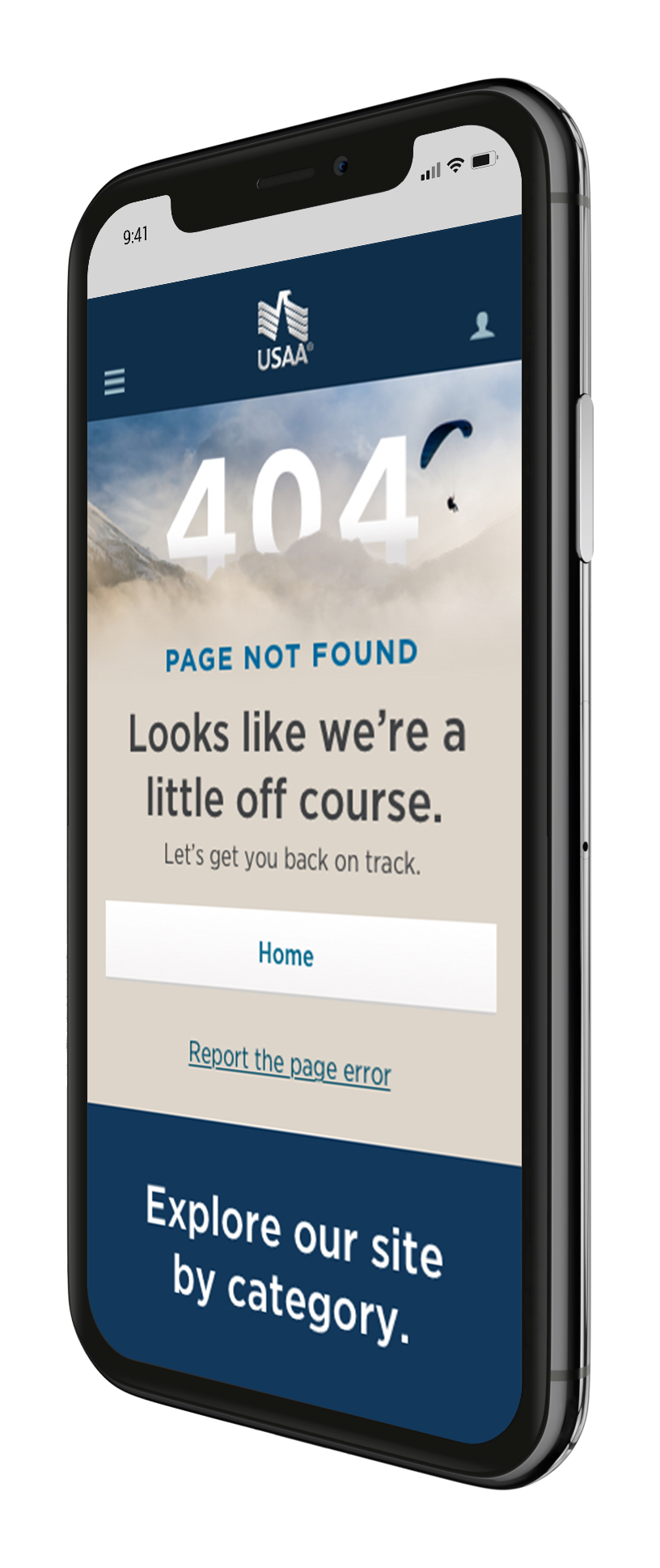

USAA 404 Page
Overview
USAA — the financial institution that serves members of the military and their families — asked us to provide design recommendations based on a competitive assessment for their first ever Error 404 experience.
I was tasked to design a responsive experience based on what we learned that leaned human in tone and made it easy for USAA members to find their way back on their journey.
The sweet spot
The best 404 experiences are able to bridge the gap between functional and human centered design. Here’s what we had our page include:
Wayfinding Options: provides recommended links and site map
Consistent Navigation: maintains global navigation for alternative path and link home
Error Rationale: describes the error that has occurred and why, with a human tone
Request for Feedback: allows user to report the 404 error
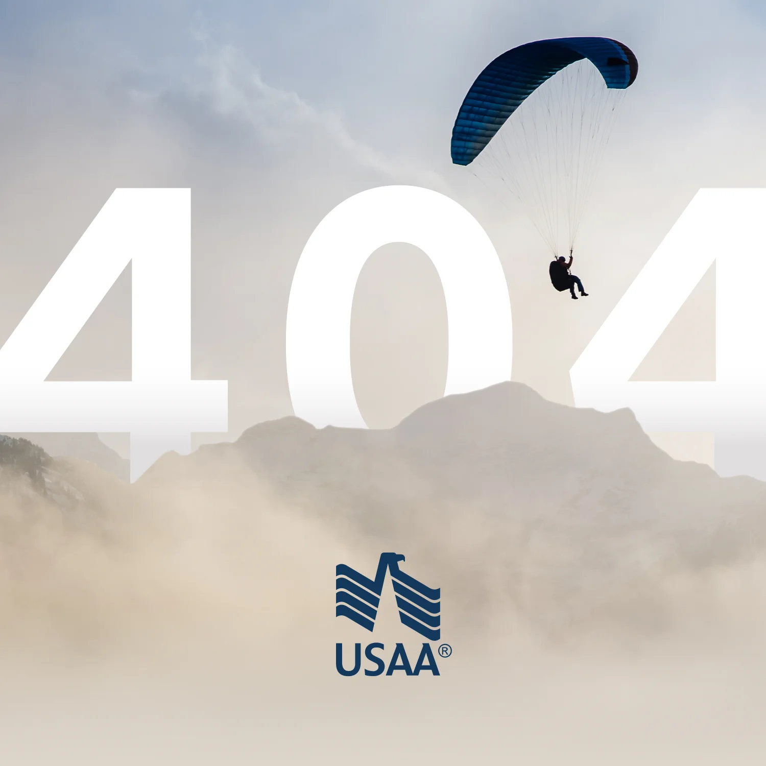
Relatable Copy: recognizes the error by poking fun at the mistake while staying on brand
Engaging Design: ooooh que bonito!